There are a lot of different visualizations in Pokeit. You can choose from line graphs, scatter plots, donuts and tables. The one thing they have in common is they’re displaying fields from your database in a visual way. Each field represents one facet of your poker game, from player name, to bet size, to whether an opponent 3-bet the turn. The combination of these fields and how they’re shown is what makes each visualization unique.
How to add a field

There are two ways to add a field to a visualization:
- Click on the gear icon to open the settings panel. The default view is a panel where you can select fields for your visualization. If you’ve navigated away from that screen, look for a button that says “Presentation” and click it. Here you can select which fields you want from the dropdowns. Hold Shift + Ctrl to drag
- Click on the button in the toolbar that looks like a table or a graph. It’s one to the right of the filter button. Use the drag and drop interface to arrange your fields and add new ones
Rows, Columns, and Axes
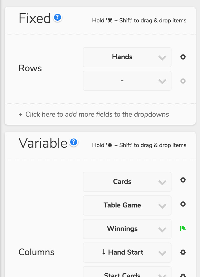
One thing to keep in mind is the difference between what’s a row and what’s a column. Let’s say you’re looking at the Hand Browser and you’ve pulled up the list of active fields from the settings panel. Under the “Rows” section you’ll see “Hands”. This means that each row represents an individual hand. If you click on a row, you’ll see a hand detail in the side panel. “Columns” is where you select what information you want to show for each hand.
Say for example you’re looking at something like the Games Report. Each row is a game and the statistics for that game are columns in the table. If you selected “Stakes” from the dropdown, the Report would update to show statistics for each of the stakes you’ve played. In tables you can even include multiple fields in the “Rows” section. By selecting both “Games” and “Stakes” you could analyze each game type at all the different stakes you’ve played.
How we describe this is different when we're looking at a graph instead of a table. Instead of rows and columns we just have axes. These axes can be fixed or variable. Fixed axes are like rows, and variable axes are like columns. The “X-axis” is always fixed on line and area graphs because these shapes require that you don't have more than one data point for each value of x. For other shapes like circles, symbols and rectangles, this restriction doesn't apply. If both axes are variable you have a scatterplot. If both are fixed you get a grid. You can find out more about this in the help article Designing a layout.
Other Dimensions

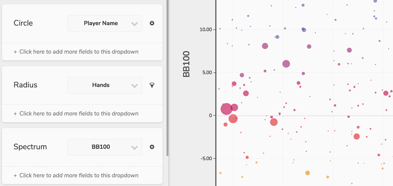
In graphs you can use fields to create color and radius scales. Fields can be added to these dimensions in the same way you would add them to a table visualization. Some dimensions only accept a single field while others let you select more than one. You can also add fields to the tooltip so it’s available if you hover over a data point.
Axes and other dimensions can be scaled in nonlinear ways. Simply click on the label for that axis or dimension (e.g. X-Axis, Spectrum) in the settings panel and choose a new scale from the dropdown. Scales include Linear, Logarithmic, Square Root and more.
Field Options

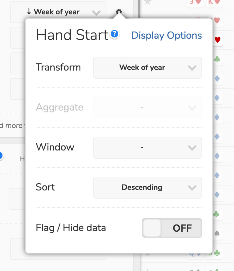
Fields themselves can be configured in a number of ways. Simply click on the gear button next to the field name to access these options:
| Transform | Certain fields like dates, can be transformed into their component parts (e.g. Day of Week, or Month of Year) |
| Aggregate | Take averages, calculate standard deviations, sum up totals or find the minimum or maximum values |
| Window | Generate cumulative sums, moving averages, or overall totals |
| Sort | Sets the order of the dataset to this field (ASC or DESC). Combine with the Limit option in the Presentation to generate a ranking |
| Flags | The same type of conditions which can be applied to filters can be used to highlight specific ranges or values |
Display Options

You can modify how a field is displayed in a visualization from that same popup. Click on the gear button next to the field name and then follow the link in the top right that says “Display Options”. The following options are available:
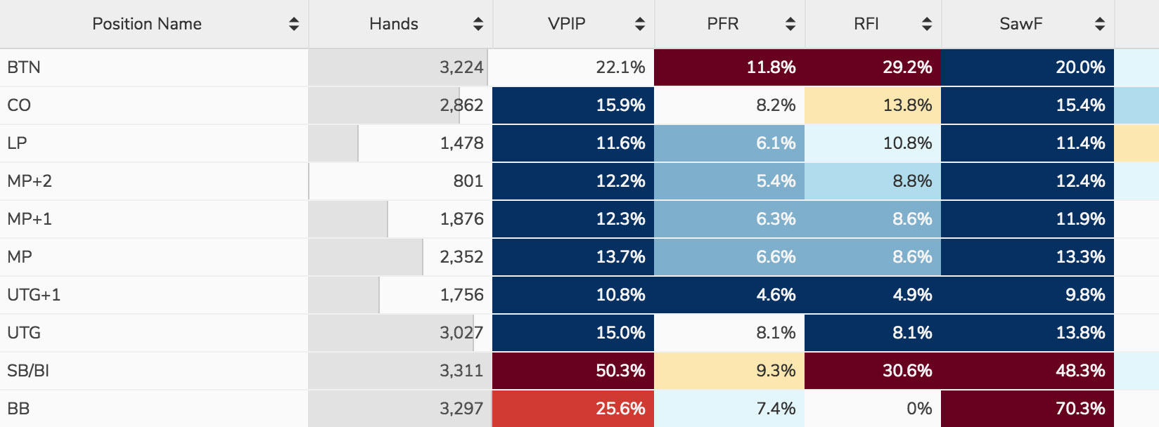
| Min-Max Bars (tables only) |
Adds a bar to each cell representing how close the cell’s value is to the min or max |
| Distribution Spectrum (tables only) |
Available for all statistics. These colors represent how far away in standard deviations values are from the average |
| Color (graphs only) |
You can select a color from your layout’s palette to apply to each series in your graph. This setting is ignored if you’ve applied a color spectrum |

