The layout of a visualization defines the style, sets the shape, and fits it all together through axes & dimensions. The layout, along with the source and the presentation form the 3 major parts of a visualization.
Theme
Color palette and style options can be configured in the theme section. Axes and gridlines can be styled as well. See the article on Styling themes to find out more.
Shapes

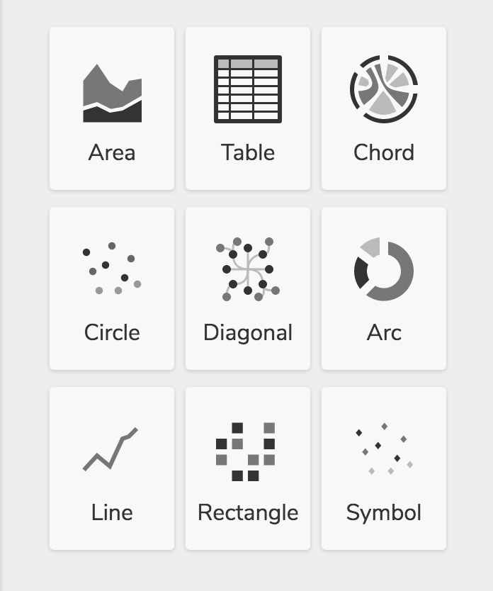
Data can be expressed with common shapes like lines and circles, or with exotic ones like chords and diagonals. Here are the shapes available in Pokeit:
| Area | For stacked continuous charts |
| Table | Scrollable set of rows & columns |
| Chord | Shows relationship among groups of entities |
| Circle | Scatterplots and bubble graphs |
| Diagonal | For constructing tree diagrams |
| Arc | Circular shape divided into slices |
| Line | Continuous function of X & Y |
| Rectangle | For bars, columns & grids |
| Symbol | Choose from ♦, ✚, ○, □, △ |
Properties

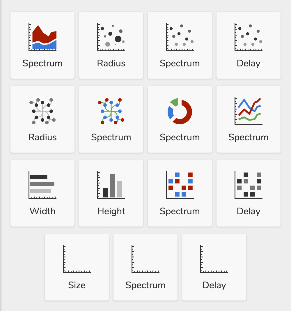
Properties of shapes such as the color or the size can be scaled based on values of a field (e.g. radius of a circle scaled by # of hands). Here are the properties you can scale:
| Spectrum | The color of bars, circles, and other shapes can be scaled to produce a heat map |
| Radius | The size of circles can be scaled based on a the value of a field |
| Size | A property specific to the symbol shape. Similar to scaling the radius |
| Height & Width | The height and width of rectangles can be scaled to create candlestick charts |
| Delay | Adding a delay phases in the appearance of your data points based on the values of a particular field |
Axes

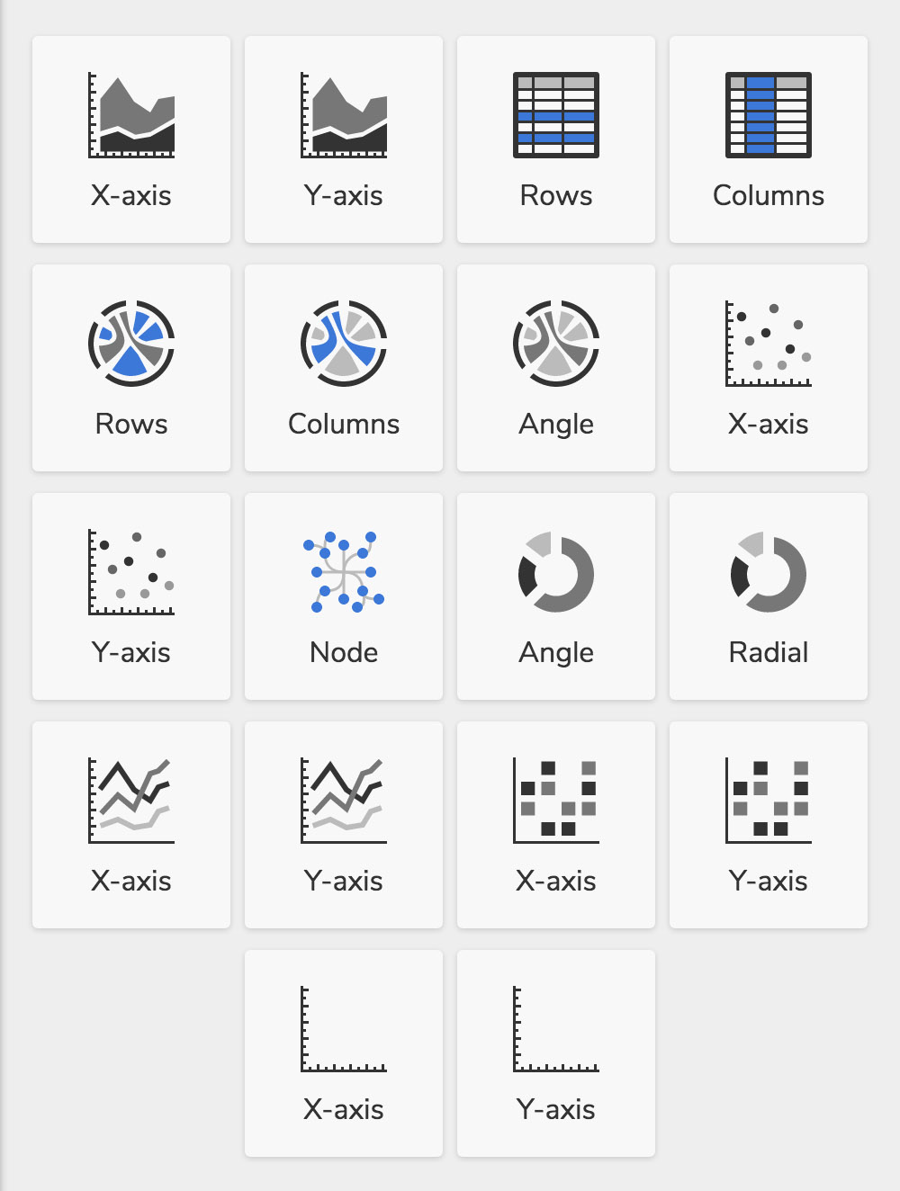
X-Axis, Y-Axis, Radial, Rows and Columns - all establish the spatial arrangement of your visualization.
Axis can be set to fixed or variable. Having one set to fixed allows you to examine linear relationships (e.g. profit vs. time where time is fixed along the X-Axis). Setting both axes to fixed produces a grid plot. Setting both axes to variable produces a scatter plot.
Variable axis can be exploded. This splits up the visualization into separate plots for each value of a particular field. For example, if you set a Y-Axis to explode and set the explode field to “Game” in the presentation section, you would generate separate plots of profit for each game you played.

