The presentation section is where you decide what your visualization should display. The fields you selected in your source can be added to the axes defined by your layout. Additional options such as setting a currency or modifying the information in the tooltip can be found in this section as well. Unlike the source and layout, each presentation is unique to the visualization it's in and can't be saved on its own.
What is the presentation?

The presentation is the first thing you’ll see when you open the settings panel. This is where you'll get to choose what you want your visualization to show. Fields can be selected from the dropdowns and dragged around within each section by holding down the Shift + Ctrl. If you can’t find the field you’re looking for, you can add it to the list by clicking Add a field at the end of the dropdown.
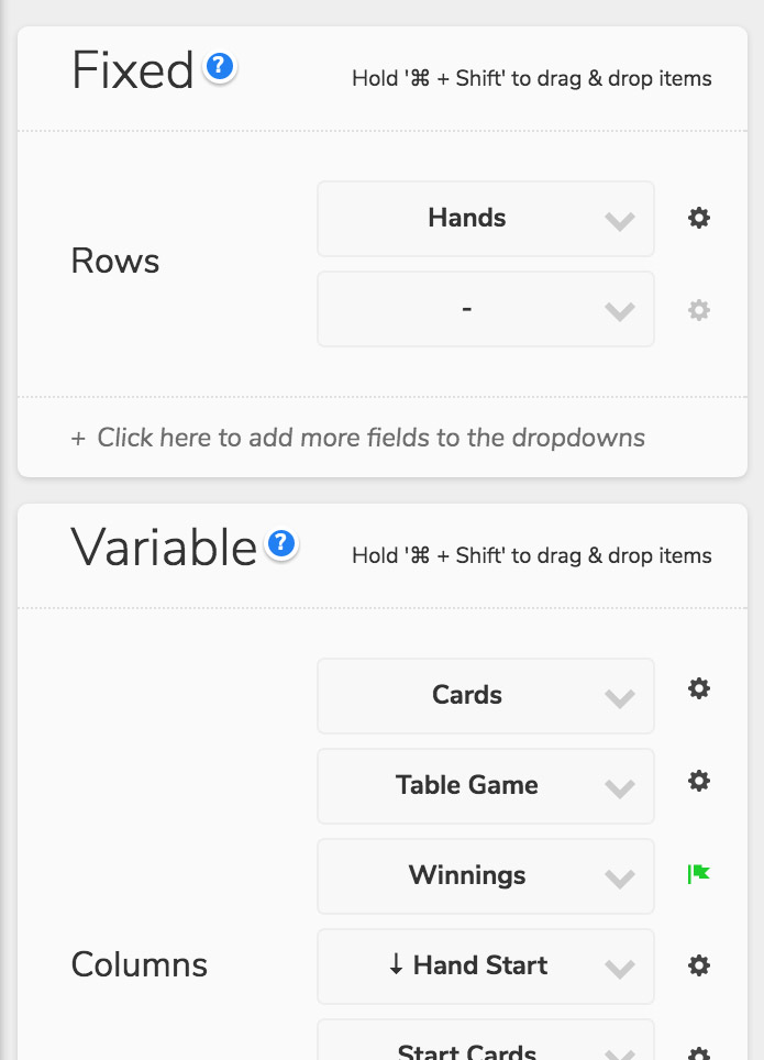
The presentation is divided between fixed and variable sections. Fields selected in the fixed section determine how your data will be grouped. Selecting "Hands" returns a dataset of all of your hands. Select "Sessions" and each datapoint will be a unique session. Tables allow you to select multiple fields to group by in the fixed section. Area & line charts where the Y-Axis has been set to “Exploded” include an extra slot for deciding what to explode by. Grid charts require that you set both the X & Y axis in the fixed section.
When there are no fixed axes in the layout, such as in a scatter plot, a section with the name of the shape acts as the fixed section. For example, in the scatter plot of BB100 vs. VPIP we put “Players” in the “Circle” section so the graph will group the data by player.
The variable section is where you select the statistics and descriptive information you want to see in your visualization. Multiple fields can go in this section. You'll often need to define how you want to aggregate these results. Sum, Minimum, Maximum, Average and Standard Deviations are all available via the field options button.
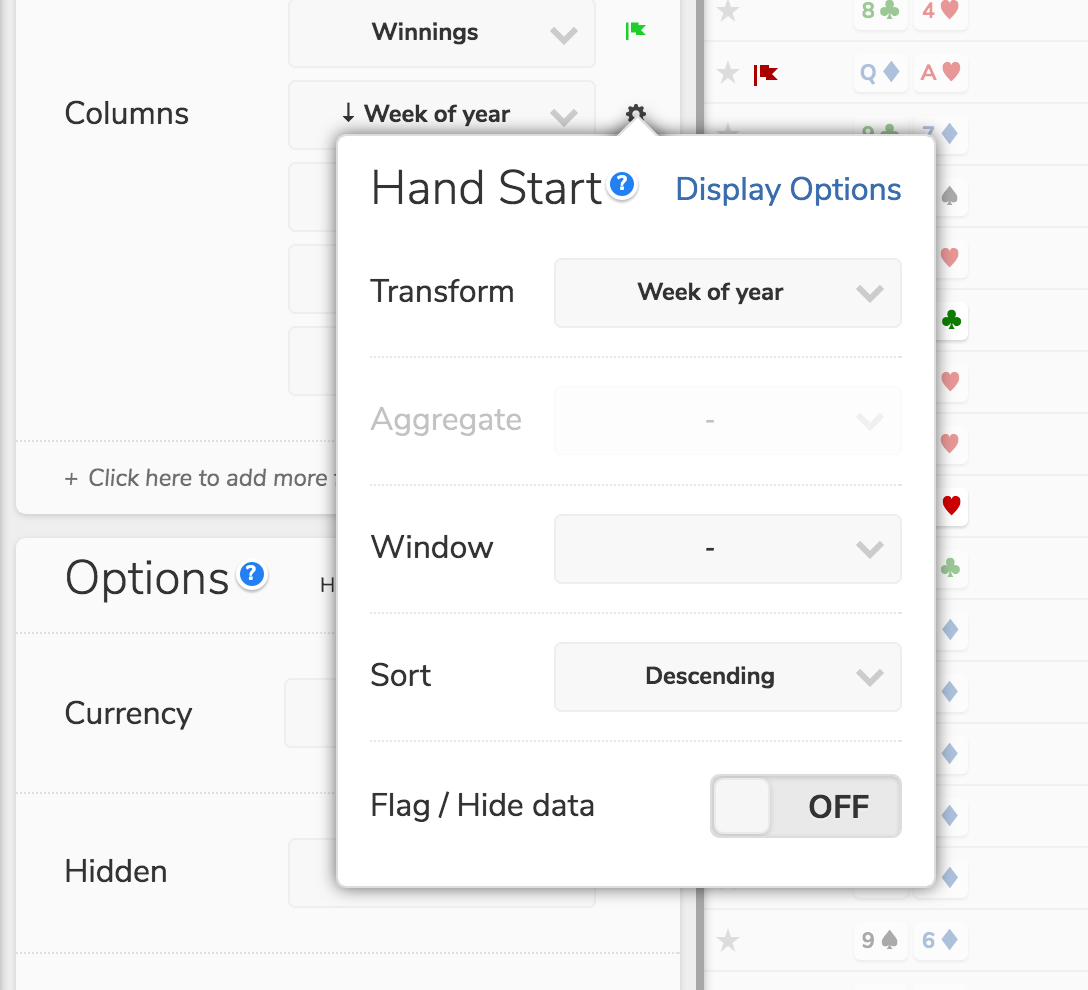
Field Options

Once added to your presentation, fields & formulas can be configured in the following ways:
- Transform: Certain fields like dates, can be transformed into their component parts (e.g. Day of Week, or Month of Year)
- Aggregate: Take averages, calculate standard deviations, sum up totals or find the minimum or maximum values
- Window: Generate cumulative sums, moving averages, or overall totals
- Sort: Sets the order of the dataset to this field (ASC or DESC)
- Flags: The same type of conditions which can be applied to filters can be used to highlight specific ranges or values. You can also use this feature to filter on the values in your visualization
Options

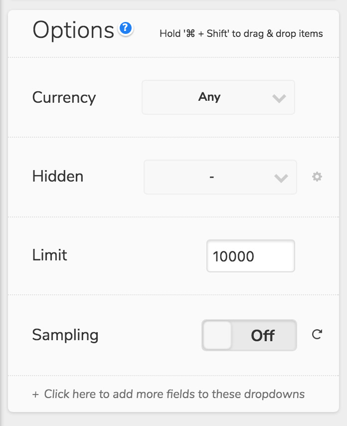
At the bottom of the presentation is a section of visualization options:
- Currency: To avoid mixing monetary values of different currencies, we require that you set a currency type for each visualization. The "Any" option can be selected to override this requirement
- Tooltip: Additional fields can be added to appear in the tooltip and will be visible if you hover over a data point in the graph
- Hidden: Fields set in this section won't appear anywhere in your visualization. This allows you to introduce a filter without having to also display that field
- Limit: Limits the number of results returned for the visualization by the value specified. By default, order in which the results are returned is determined by the fields set in the Fixed section. The sort can be set to another field via the Sort option in the field options popup
- Sampling: By default, if a value is set in the Limit section, the visualization will truncate the number of results returned. If sampling is turned on, a random sample of records is returned instead
- Legend: By default, the legend will automatically adjust to fit the space you have on your screen, but you can force it to be on the top, bottom or hidden completely if you like

