What is a visualization?

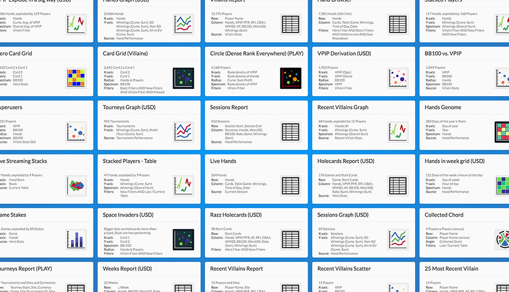
Visualizations are how Pokeit delivers information to you about your poker data. A visualization can be a table, a line chart, or a scatter plot. It can show villains, heroes, sessions, hands, and tournaments. You can filter visualizations to show tiny slices of your data or you can zoom out to see all your hands at once. Visualizations are completely customizable—from the shape, to the theme, to the colors of the lines, and to the statistics being displayed. You can build them from scratch or you can use the defaults as starting points for making your own. You can interact with them by zooming in, viewing individual hands, or hovering over data points with the tooltip.
There are a lot of ways to use visualizations in Pokeit and we hope to get you started on the right foot!
Loading visualizations

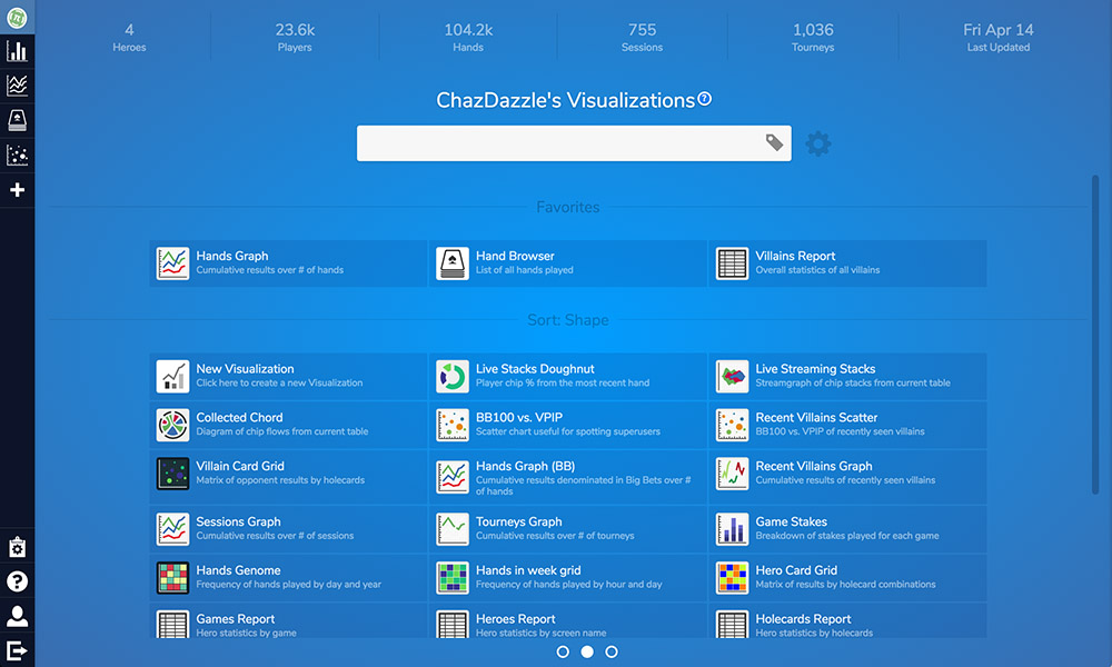
All you need to do to load a visualization is click on it. This can be done from the main dashboard or from the visualization list section. Once you click on a visualization, an icon for it will appear in the black header indicating that it’s been loaded.
The data for the visualization will immediately begin downloading. Once it’s finished rendering, the visualization itself will appear in the center of your screen. The visualization can be removed by hovering its icon in the header and clicking on the close button. Otherwise, the visualization will remain attached even if you reload the page or log out of your account.
Interacting with visualizations
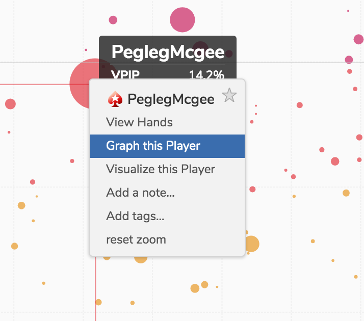
 You can interact with visualizations in many ways. For example, you can right-click on any row or data point to open a context menu. From that menu you can apply tags, stars or notes. Data points marked this way can be highlighted or filtered by clicking on thetag button in the visualization toolbar. You can also load entirely new visualizations based on the the data point you clicked on. If for example, you were viewing a report of tournaments, you could from jump into a new visualization of all the hands from each one from this context menu.
In scatter plots or line graphs you can zoom in close by pinching and zooming on your trackpad or by scrolling with the scroll wheel. Hovering will also produce a tooltip in graphs providing information on individual data points. Axis coordinates and data point labels will be displayed by default and other information can be added to tooltip from the settings panel.
Visualizations can also be shared with others. Clicking on the sharing button in the top right of the toolbar will produce a dialog with a number of options. You can set a title, control what information is accessible, and get the word out with social media links.
Editing visualizations
 You can edit your visualizations from the settings panel. The settings panel can be opened by clicking on the gear button in the top left of the toolbar. Once clicked, the settings panel slides out from the left and you’ll see options for changing the fields on display. Fields can be chosen from the dropdown and dragged to where you want them by holding down shift + ctrl. Scroll down just a bit and you’ll see other options such as setting the currency, controlling how many records you want returned, and more.
In the top right corner of the settings panel is a filter button for switching to the filters section. This section contains all of the filters set for your visualization. There should always be one filter at the top for either Hero or Villains mode. Depending on the visualization, you may find other filters below that. There’s also a section called "Filter Workspace". Filters set here are shared across all your visualizations.
 Because changing fields and filters is one of the main ways you’ll be interacting with Pokeit, we’ve included shortcut links for these functions in the visualization toolbar. Here you can change your currency, fields, and filters quickly from dropdowns without having to go through the settings panel.
Any changes you make can be saved by clicking the save icon.

