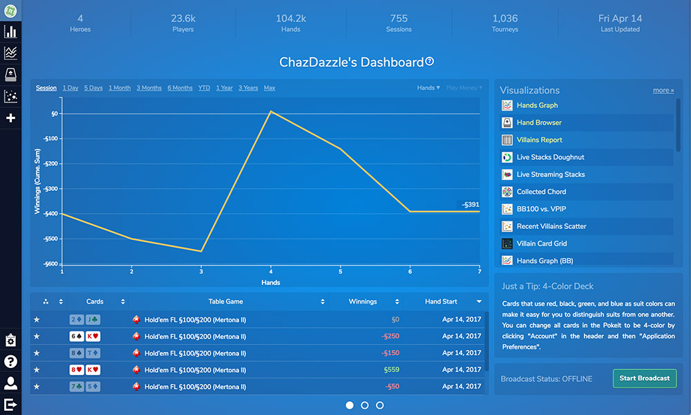
The dashboard is the first thing you see when you log into Pokeit. It includes:
- An overview of your poker results
- Summary statistics about your database
- A list of all your visualizations
- Tools for customizing the different aspects of your visualizations
The dashboard also serves as the jumping off point for viewing visualizations. Visualizations are the “apps” of Pokeit providing dynamic views of data displayed as tables or graphs.
Poker Overview
The first of the three dashboard sections provides a quick view of your poker results. It includes a prominent graph widget with a table below it. The data displayed here is determined by the controls above the graph. There you can control the timeframe, the type of data being viewed (either hands or tournaments), and the currency (e.g. USD, EUR, Tournament Chips). Timeframes set to 1 month or less return hands as data points otherwise sessions are used. You can view individual hands by clicking on them in the table.

A list of your visualizations with the favorites at the top can also be found in this section. Clicking on any of these visualizations will open them for viewing. Clicking on the 'more' link will slide you over to the visualizations list which gives you a few more options for picking which one you want to view.
Below the list of visualizations you’ll find a tips section. Here we provide suggestions for how to get the most out of Pokeit. Below that is the broadcast button used for starting a live stream.
You can return to this section of the dashboard at anytime by clicking the Pokeit icon in the top left of your screen.
Metadata
Anchored to the top of the dashboard are tiles providing metadata about your Pokeit database. Here you can see the number of:
- Heroes you’ve selected
- Players you’ve played against
- Hands, session, tournaments played
- The time when the database was last updated

You can click on any of these tiles to open a popup with recent data points.
Visualizations list
The second of the three dashboard views is an expanded list of all your visualizations. There are three ways to access this section:
- The plus button from the black header at the left or top of the screen
- The second of the three dots at the bottom of the screen
- The 'more' link in the first section of the dashboard
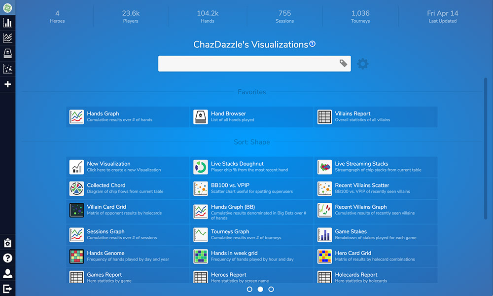
Once you’ve done that, you’re presented with a larger, more detailed view of your visualizations:

The searchbox in the center of the screen makes it easy to find the visualization you’re looking for. Simply type in the name or type of visualization to narrow down the list. Visualizations can also be searched for via tags by clicking on the tag button.
The gear next to the searchbox provides additional viewing options. You can change the view from compact to comfortable to increase the size of the icons, or you can change it to list mode for a more tabular view. Visualizations can be sorted by a variety of properties including Last Opened, Last Updated, Alphabetical, and more. You can also select which visualizations you’d like to favorite. Favorited visualizations will appear at the top of the list making them easier to find later.
Asset Manager
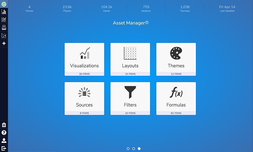
The Asset Manager is the more advanced section of the dashboard. Here you can view, alter, and build from scratch all the various pieces of a visualization. Visualizations are composed of layouts (which provide the styling) and sources (which define the data).

Each component here is modular, letting you swap in and out different pieces as you go. Layouts contain a a theme which can be customized with your choice of styling, patterns and colors. Commonly used filters can be saved for later, and there’s also a formula builder you can use to create your own stats.

